I added this to the faq.
It seems we cant edit our post
That is correct. After certain time period, you cannot edit your previous work. This preserves the integrity from this who respond later.
1 Like
Maybe the post can have allowance of two hours before get fixed . Sometimes , a new thought comes into mind or edit in adding subtract words or due to typo etc .
1 Like
There is a 1440 minutes limit set.
However, only basic user and above can edit the post.
I think this is system default method.
1 Like
We have added who-is-online plugin. Now you can see who is online while you are there.
2 Likes
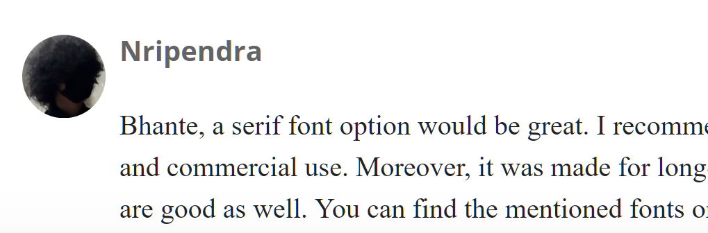
Bhante, a serif font option would be great. I recommend Literata. It is open-source and free for personal and commercial use. Moreover, it was made for long-form content, but Source Serif 4, Lora, or PT Serif are good as well. You can find the mentioned fonts on https://fonts.google.com. Serif fonts are more legible than sans serif, both on screen and print. They look much more professional, aesthetic, and authoritative. Furthermore, Roboto is a better font than the current one in use on this website. So please change that. You can also use Inter, too.
1 Like
I think it will vary from person to person.
1 Like
Yes. Ultimately, it is your choice, or not, I suppose, as there is no you.
If you can figure out how the user can change his own font. I can try. I don’t think it is possible except by global actions. I prefer sanserif fonts. Since this is default, I think this is best.
1 Like
If this is what the bhante prefers, then it shall remain so.
1 Like
It might be possible with a new theme.
If you like to be making changes like this, I highly recommend installing the browser extension Stylus. It allows you to change the css for any page on the internet. To change to serif all you need is
p {
    font-family: serif
}
I don’t recommend Literata because it is missing ṁ, although the browser would probably substitute in another font for that character.
The favicon for the site is a little messy. It’s not square so the text gets cut off, at least for me:
You have a great and unique logo (the wheel and palm leaf manuscripts). Why not use that as the favicon?
I’ll try to fix the fav icon.
I’ll see about adding personal themes so you can have the font you choose.
2 Likes
fav icon fixed now
2 Likes
Looks great!
2 Likes
Note: after I wrote all this I realized that it seems to be a problem on Firefox and not chrome (Win11). But I figured I would still post it since you might not be aware.
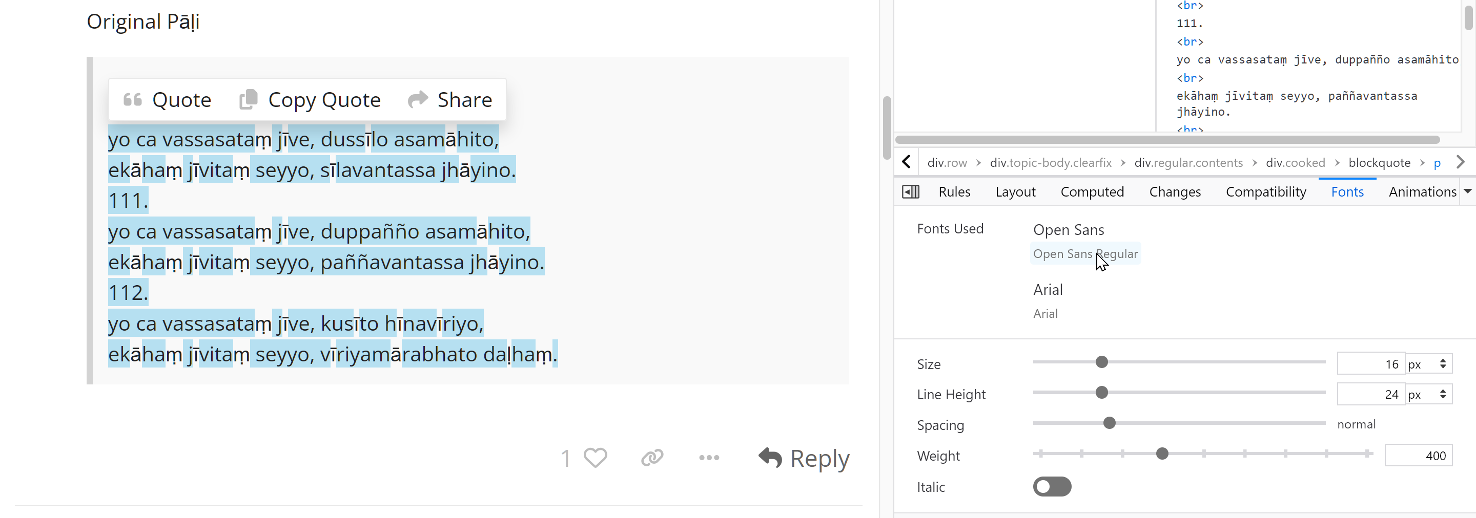
It just caught my eye that the current default font is doing substitutions for Pali letters
aā uū tṭ dḍ nṇ nṅ mṁ lḷ
Here is a screenshot of what I see for the above text:
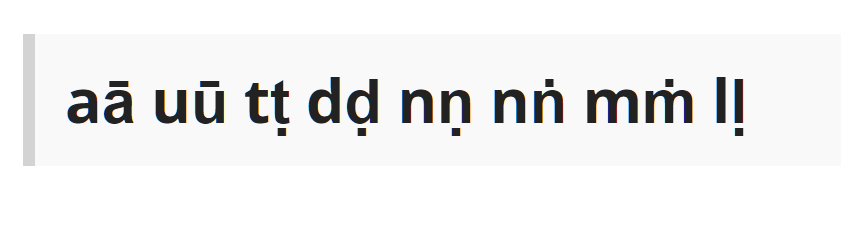
The substitution is most obvious on the t/ṭ.
To be clear: this is a very minor problem that you may just want to ignore. But if you were already going to be messing around with fonts you might look into it.
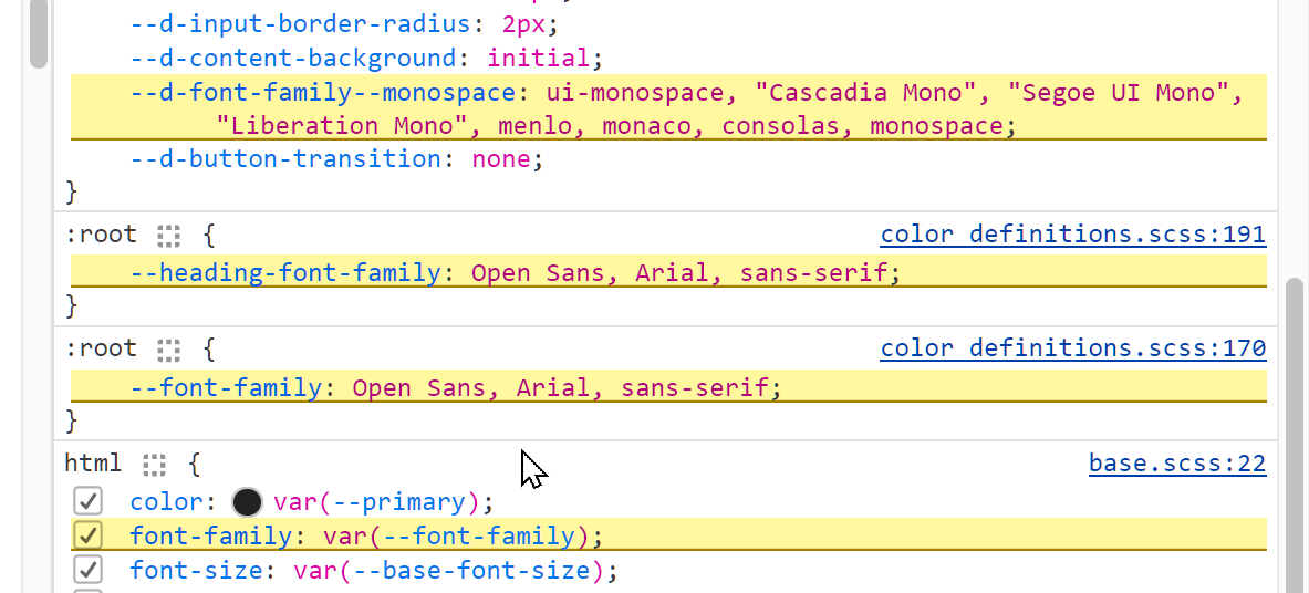
It appears that the problem has to do with Open Sans.
I’ve never actually used the Fonts tab in devtools, but I do see this on a different post:
1 Like